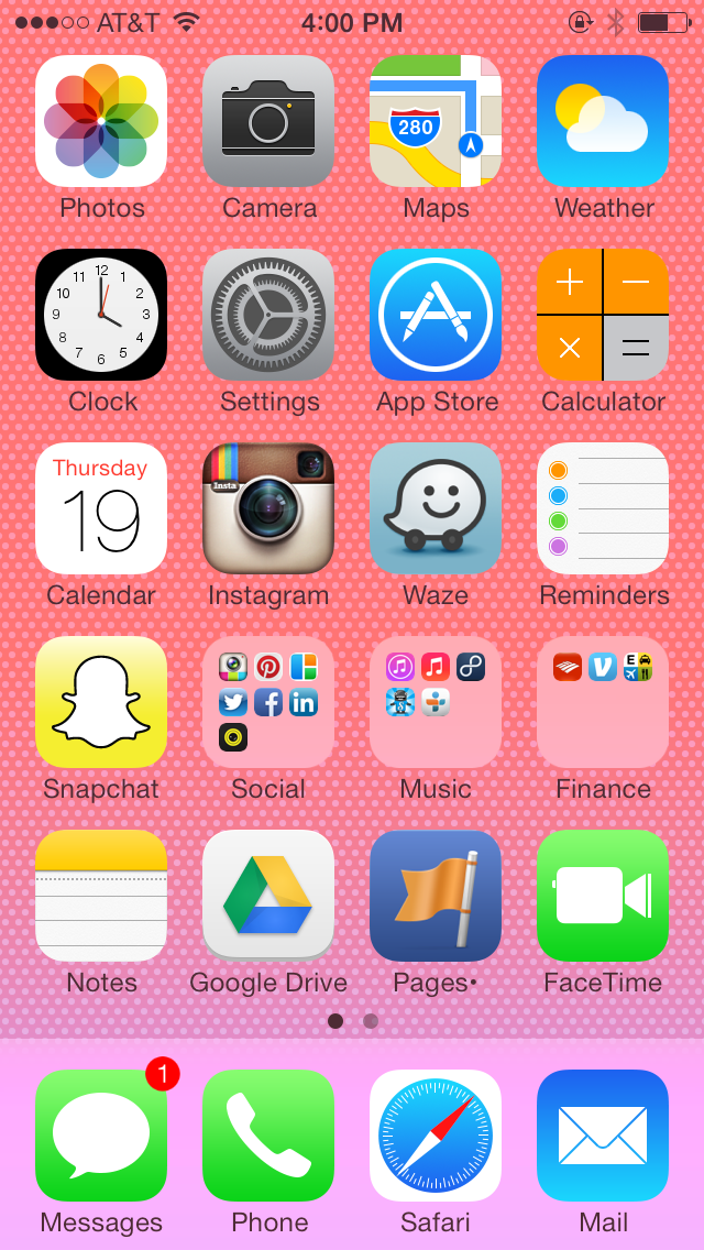
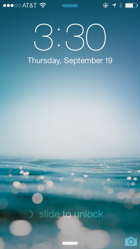
iOS 7, Apple’s newest operating system, launched yesterday. This update is the biggest one they’ve had in a few years, and the main difference is the complete overhaul of the user interface. It all looks…really different. It feels like having a new phone.
How to get it:
- You must have an iPhone 4 and Later, an iPad 2 and later, an iPad Mini or an iPod Touch 5 Generation (Not all features available on all models).
- To install, head to Settings > General > Software Update. It will take an hour or so to install iOS 7, and your phone need to be connected to a power source.
- Once it’s downloaded, enter your Apple ID and reboot.
Here are some of the biggest differences:
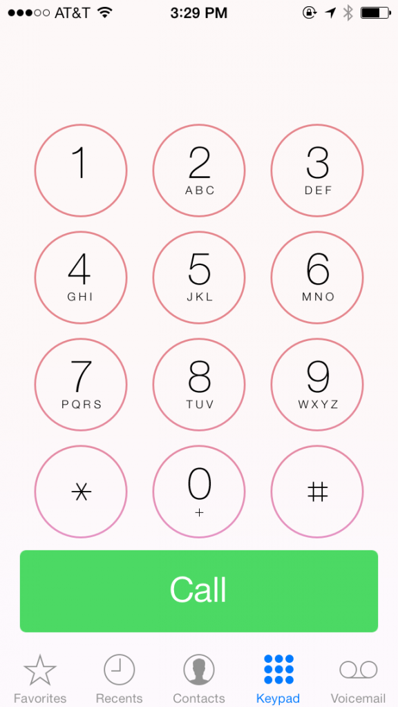
- There’s a completely new look. The icons are all flat and some are redesigned (check out the new Photos!). The typeface is thinner, and most all screens have a slightly new look.
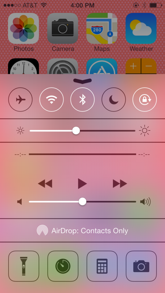
- Control center. In iOS 7, you can swipe up from any screen to immediately access your control center. Quickly turn on or off Wifi, airplane mode, Do Not Disturb, portrait orientation and AirDrop as well as adjust brightness levels, volume and access the (newly built-in!) flashlight, clock, calculator and camera. Saves a lot of time previously spent digging through the settings menu.
- Speaking of AirDrop. AirDrop is a seamless file-sharing service you can use to share anything with people who are physically close to you. For more on AirDrop, read this helpful article.
- Camera. The new camera lets you swipe seamlessly between video, photo and panorama. You can also apply filters before you take the photos– No more waiting until Instagram!
- Double tap. It’s much easier now to switch between open applications. Previously, double-taping the home screen was used to see what applications were running in the background (and then closing them to save battery). Now, when you double-tap, you can quickly swipe through all your open screens and jump between them, almost like tabs in an Internet browser. And to close apps, swipe the preview screen up.
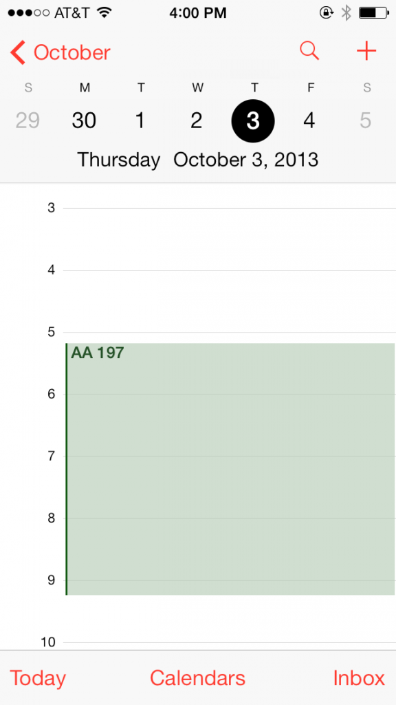
- Calendar. For me, the new calendar is not as functional as the previous design. iOS 7 shows all your events at the time they occur, whereas the old calendar app stacked them. I liked being able to see more events at one glance, rather than scrolling through.
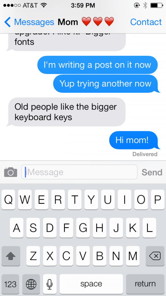
- Keyboard. Bigger keys = fewer typos. Beautiful. And I guess the “old people like the bigger keyboard keys.”
- Reminders. This is a small change, but essential for me since I use the reminders app regularly. You can now have more than one “list” of reminders, allowing me to sort them by list, personal, etc.
- FaceTime. In iOS 7, FaceTime has it’s own app, like Phone or Messages. I’m not quite sure what the point of that is, but hopefully it will encourage more FaceTiming– my favorite iPhone feature that I constantly forget to utilize.
This is honestly only a fraction of the changes in iOS 7. You’ll have to download and explore to find more (think new alert sounds/ringtones, new wallpaper options, and new transitions between applications). Enjoy your “new” phone!
Posted on 9/19/2013
Liz Wassmann is on the Dot Complicated editorial team and has written for a variety of Bay Area publications over the past several years. When she’s not reading or writing, she can be found daydreaming about her next trip overseas and practicing parallel parking. Follow her on Twitter at @lwassmann13.




Leave A Comment
You must be logged in to post a comment.